Digital partners in launching the FLITELab* brand - and the AMPJet surf foil.
In surf foiling, identity matters. This is a culture of pioneers. Riders who piece together boards in garages. Who swap masts and wings across brands. Who test, tweak and rebuild until the ride feels right for the conditions.
They do not see themselves as consumers. Through their obsession with performance find themselves at the edge of a cult sport.
And they are skeptical.
FLITELab* was entering this world with a radical new product, AMPJet, an inboard jet system that created a new category of assisted foiling. But there was a tension.
It sat under Flite.
Flite had defined the eFoil category. Premium. Polished. Precise.
For many in the surf foil community, that world felt adjacent, not authentic.
The brief was clear:
FLITELab* is looking to create a new brand that sits under the Flite brand but away from Fliteboard
FLITELab* needed to feel like it came from the garage, not the showroom.
From the test lab, not the pedestal.
It had to build trust from the ground up. Earn credibility with experienced foilers. And launch alongside a category-defining product without looking like it was trying too hard.
At the same time, it needed to live inside Flite’s existing technical ecosystem.
We partnered closely with Flite’s Design, R&D and Marketing teams to craft an anti-brand. One that could disrupt the category from within, while standing culturally apart from its parent.
Product R&D moves quickly and rarely in a straight line. The product and brand were developed in parallel, requiring close collaboration and constant adaptation. As the hardware evolved, so did the design system, the board interface and the creative direction. We operated as one integrated team.
Everything was anchored in three behavioural truths:
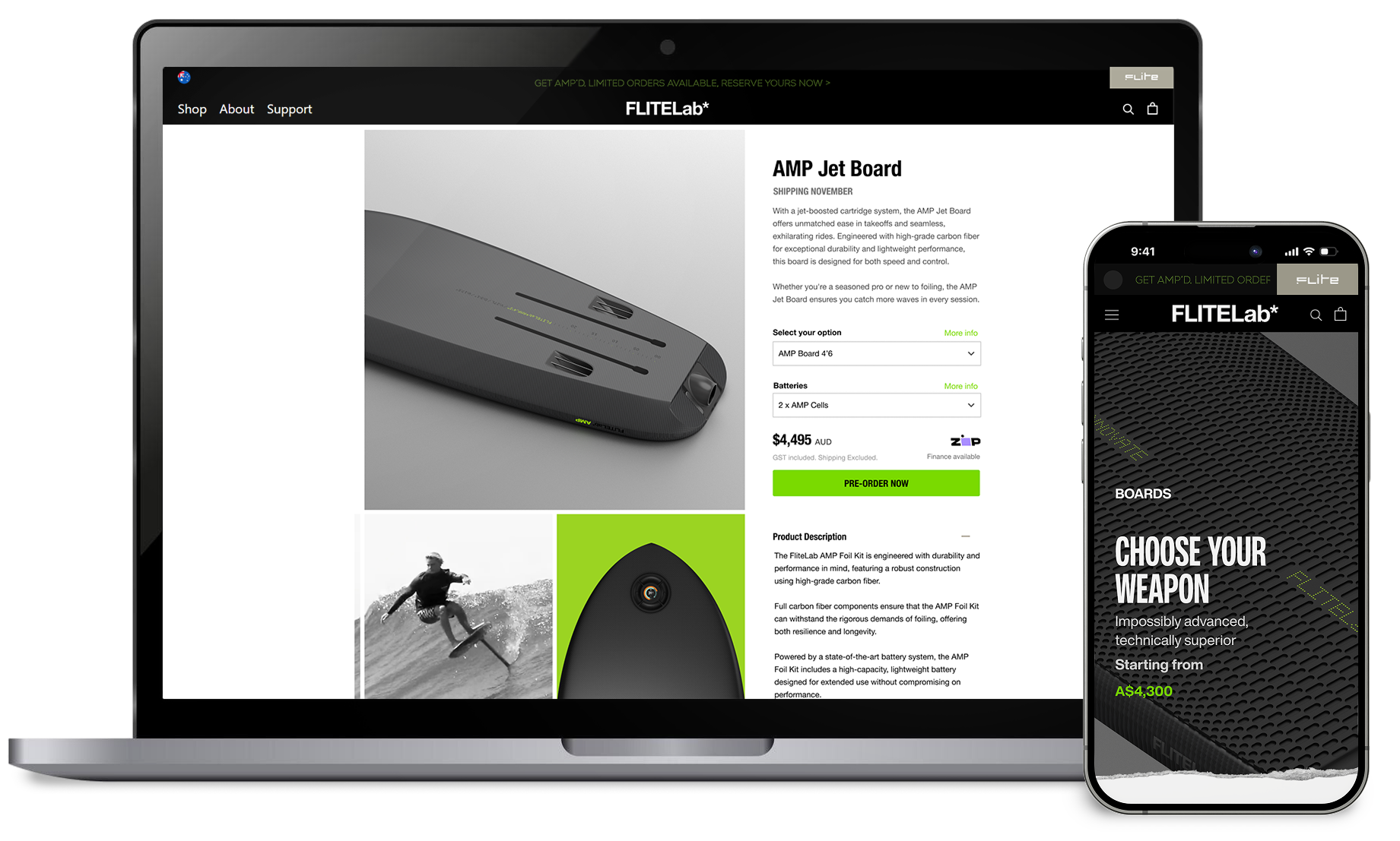
So we designed a modular e-commerce architecture to match. Customers could buy a complete AMPJet kit or assemble their own configuration - board, mast, wings, battery and cartridge. This structure mirrored existing behaviour in the category, aligning with the founder’s modular product philosophy and building trust through behavioural alignment.
Digital Brand Exploration
With the Flite creative team, we developed a disruptive visual language that rejected luxury cues and complemented the AMPJet product positioning "Ride the impossible".
Raw black and white imagery, motion blur, spray textures and stark contrast were paired with custom ticker-style dot matrix typography referencing early web culture and 90s grunge. The tone was beta, not polished - designed to be used, tested and pushed.
The website became the primary stage for this identity. It needed to clearly signal this was not Fliteboard, earn respect from experienced foilers, and position AMPJet as a genuine leap forward. Through rapid prototyping and iterative test and learn cycles, we built a digital experience showing real riders in real conditions - no studio gloss, just proof of capability.

Digital Brand Exploration

Website Strategy, Wireframing & Design

Modular E-commerce Architecture

Prototyping, Testing & Learn

Working as one team, through countless rounds of designs, prototypes, testing, and iteration -we delivered a series of digital interfaces that created a cohesive FLITELab* customer experience.
Six months ahead of launch, we created a disruptive holding page that introduced the attitude of FLITELab* and enabled early pre-orders. This seeded community interest and validated demand before full release.
The full website launched alongside AMPJet, bringing the anti-brand to life through bold visuals, rider-led storytelling and category-defining positioning.
We helped shape the integrated LCD interface that enables riders to boost onto waves, adjust output and track performance. Features such as wave measurement, GPS data and leaderboards added progression and community depth.
To support brand separation, we redesigned the App experience for FLITELab* riders. The visual language and interaction model aligned with the new identity while maintaining shared technical architecture.
All digital components were delivered in time for testing and launch. Strong demand followed, with initial runs selling out quickly.
FLITELab* did not aim to position 'assisted foiling' as a shortcut. It positioned it as an alternative, and a progression. By aligning brand, behaviour and technology, we helped create a credible bridge between pure surf foiling and powered innovation.
The website established cultural legitimacy in a skeptical niche. The modular commerce structure respected how pioneers actually build and experiment.
The App and LaunchPAD reinforced a cohesive yet distinct system experience.
Most importantly, the project proved that a premium parent brand can incubate a disruptive subculture brand without dilution.
Two identities.
One ecosystem.
No compromise.
Together with the Design, R&D and Marketing teams, we helped bring to life a brand designed not to sit on a pedestal, but to be ridden hard, tested openly and evolved continuously.
.svg)

